Advil Recreation

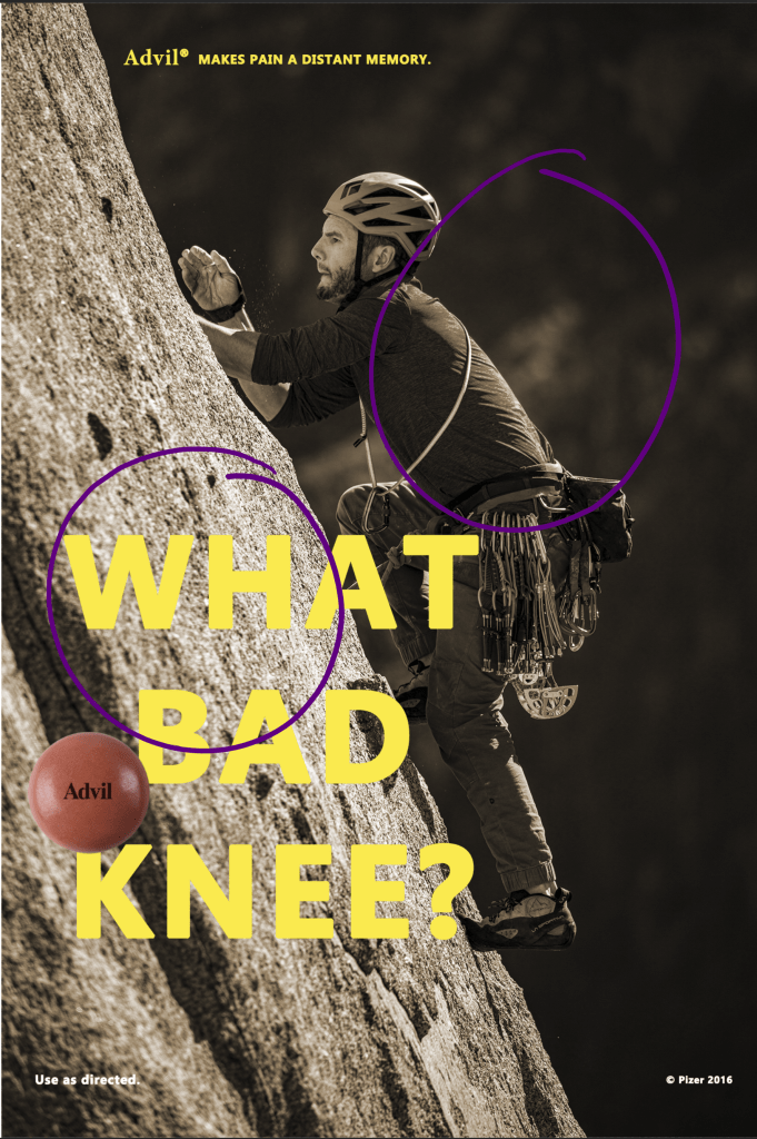
Advil Print Ad Original

This week I analyzed an Advil print ad and recreated my own using Adobe Photoshop using same color, contrast, design, and typeface. Original Advil Ad from 2016.[https://docs.google.com/document/d/1JLsLpNRlXIfKMs8DJl2i1msQ4WHvE7xEqiVZDhH8qig/edit

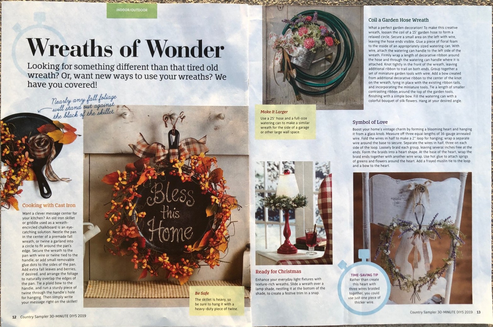
The original print ad depicts what a body can do with the help of Advil.

Design

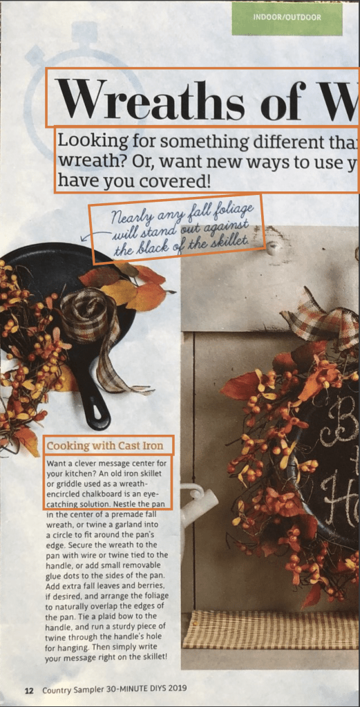
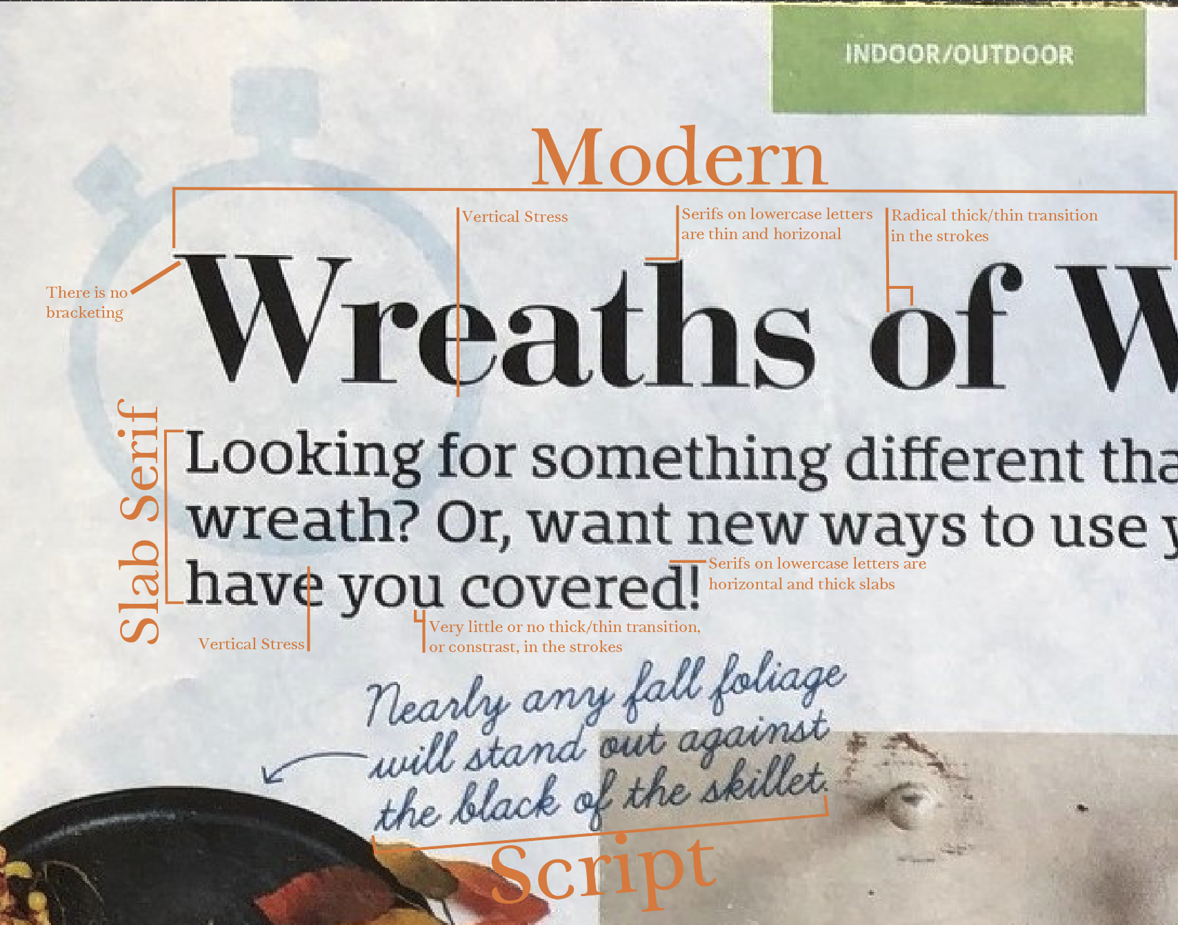
The design is center aligned. The yellow is a strong contrast from the sepia background. It is also the same yellow used on Advil bottles. The proximity of the typeface with the woman is to bring the eye to the elbow and what she is doing.

Typeface

The typeface for the main font is sans serif. It is also is all caps in bright yellow to bring the eye to the purpose if the message. The typeface is used throughout the ad. The advil typeface is slab serif that represents the product itself from the containers.

Color

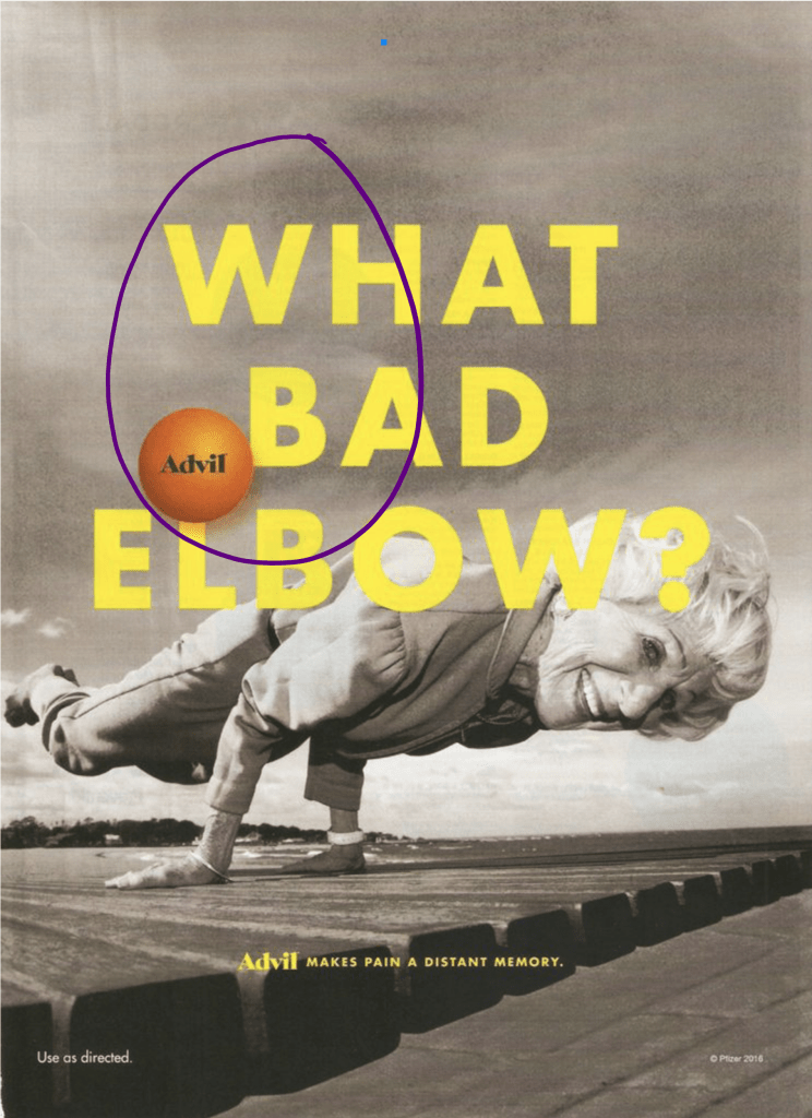
The color for the picture is sepia. It helps the viewer focus on the bright yellow text. But it does not overshadow what the picture is about.

New Ad Created


Photo by Patrick Hendry on Unsplash https://unsplash.com/photos/WmqrByl0qXE

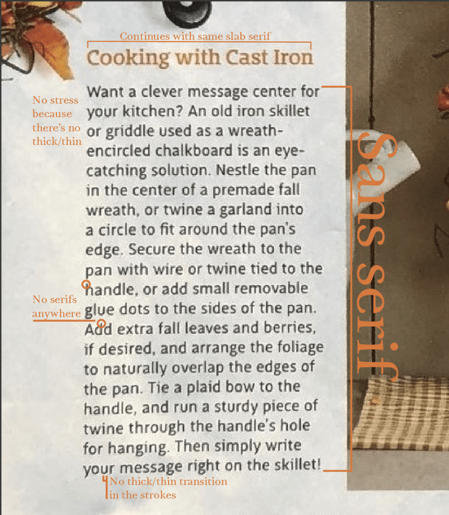
In this ad, I used a photo of a man rock climbing provided by Patrick Hendry on Unsplash. Thank you for such a great photo! I used Adobe Photoshop to recreate the ad.

Design

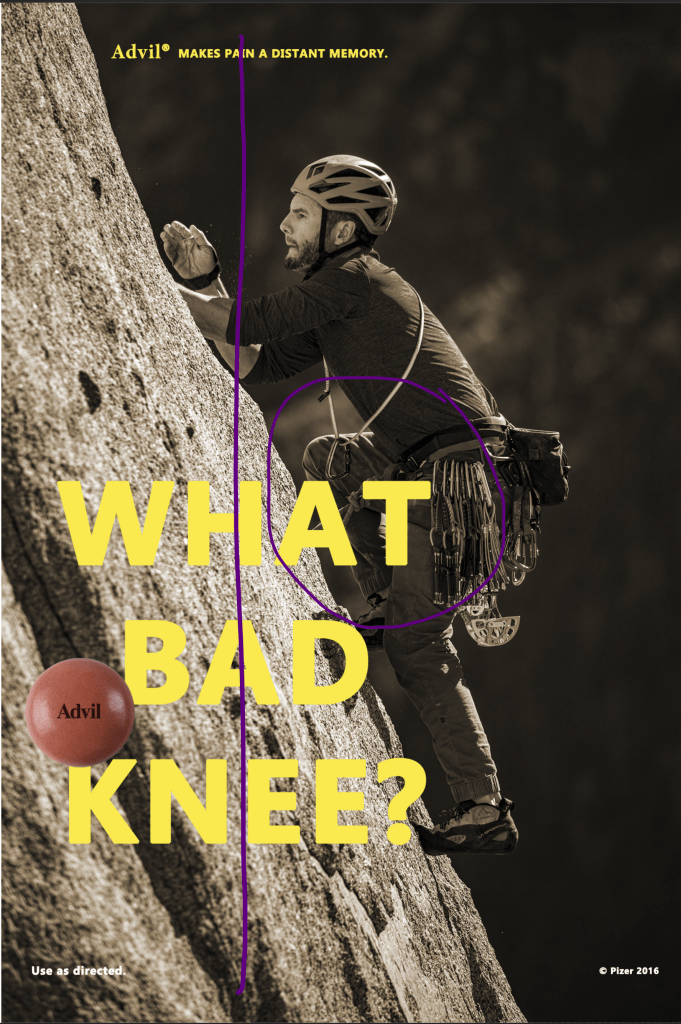
Because the photo was set with the man in the middle, I moved the typeface to the left of the rock climber. This was to focus specifically on the knees. I decided to push the typeface to the left of the ad centered around the knee. I continued this with the upper font as well to keep the alignment.

Typeface

The typeface for the main working is Erbima Bold. For the word Advil, I used Minion Variable Concept. I also matched the size and bold of the original ad.

Color

I used the eyedropper in Photoshop from the original ad on the typeface, saved it to my color palette, then used it in the recreated ad. I also changed the color photograph to sepia to replicate the original ad.

Wrap Up

Using design, typeface, and color, I was able to recreate the ad for Advil all within Photoshop. It gives the same concept with the pain-free activities that are performed with using Advil.

It’s All in the Details

Thanks to Best of CountrySampler 30-Minute DIYs. Winter 2019 Editor: Susan Wagner. Stylists/Designers: Nancy Borsodi, Christy Crafton, Carolynn Geesaman, Rene Haines. Photography: Ryan hake, Matthew Oent, Shane Pequignot.

A Magazine Spread

Time and creativity are essential while creating a magazine spread. The appearance is what draws people to read it. The typeface and photography play a big role in this. If the typeface is not pleasing to the eye, it will detract from the article. It will even make it hard or easy to follow. This article is about all the amazing things that can be done with wreaths within different styles. The heading pulls the eye in to understand the article and the pictures make us think, “I want this design.”

Typeface

Four different typefaces are introduced in this article. Each typeface shows clear contrast to the other. The heading stands out to draw the eye in.

Details Matter

Modern, Slab serif, Script, and Sans serif: Each picked for clear purpose. The main heading is modern to make a impact on the reader. Modern typefaces provide and elegant look. This is a great choice. It has a clear vertical stress line through each letter. The serif is thin and horizontal, and it has a radical thick/thin transition in each letter.

Throughout the article, the headings of each project are slab serif but with a touch of color to match each project mentioned. There is little to no transitions in the lines of each letter. It also has a horizontal serif but is thick and a vertical stress line.

Script is a clever way to draw attention to an added detail with a color contrast. It stands out and points the reader to look. This script looks as if someone has written it and is connected.

The body of the article is written in sans serif. It gives the reader’s eyes a break to get the information without being difficult to read. No stress is visible because no thick/thin lines are in the lettering and there are no serifs.

PHOTOGRAPHY

I focused on the concept of wreaths to enhance chairs. In the article, it talks about the symbol of love and how to create the heart. I decided to show different ways a chair or bench can be embellished with a wreath. The photo represents depth of field. The focus is on the chair and heart wreath, while the background is blurred. This brings the eye straight to the purpose of the paragraph without any distractions.

Reverse Engineering Complete

Every little detail is essential in writing a magazine spread. The typeface, information, grammar, and photography all provide consistency and professionalism. Looking for those small details is key to keep a reader coming back. Contrast in the typeface gives purpose to the content and categorizes to provide a roadmap for the reader. The details in the photography establish a focus and creates intrigue for readers to continue. The pictures are what brings the reader in, the typeface is what keeps them reading. It’s all in the details.

Beauty Reimagined

The purpose for this assignment is to analyize the priciples of great design. I chose to focus on alignment, proximiy, color, and contrast. This ad came from http://www.campaignforrealbeauty.co.uk . Let’s dive into reverse engineering.

Alignment

Dove used center alignment between the photo of the woman and the text, but also used left justification at the center mark for the words. With this alignment, it brings the eye back to the woman and what the campaign is about.

Proximity

Proximity is used to focus on the premise of the ad: What is real beauty? It follows up (in smaller print) a call of action to get people thinking and talking about the way society looks at beauty. It is purposeful and to the point.

Color

The use of color (or lack of color) in this ad is amazing. The simple use of the color grey for the text draws us to the words. The color from the image of the woman keeps our eyes wandering back to her. The use of these colors play right into contrast as well.

Contrast

BAMto white to words! The contrast used in this ad campaign is significant. It clearly specifies and brings interest to the ad. The simplicity is purposeful and powerful. It creates intrigue so the audience will want to continue to read by clicking on the link and learning more.

Design a site like this with WordPress.com
Get started