Thanks to Best of CountrySampler 30-Minute DIYs. Winter 2019 Editor: Susan Wagner. Stylists/Designers: Nancy Borsodi, Christy Crafton, Carolynn Geesaman, Rene Haines. Photography: Ryan hake, Matthew Oent, Shane Pequignot.
A Magazine Spread
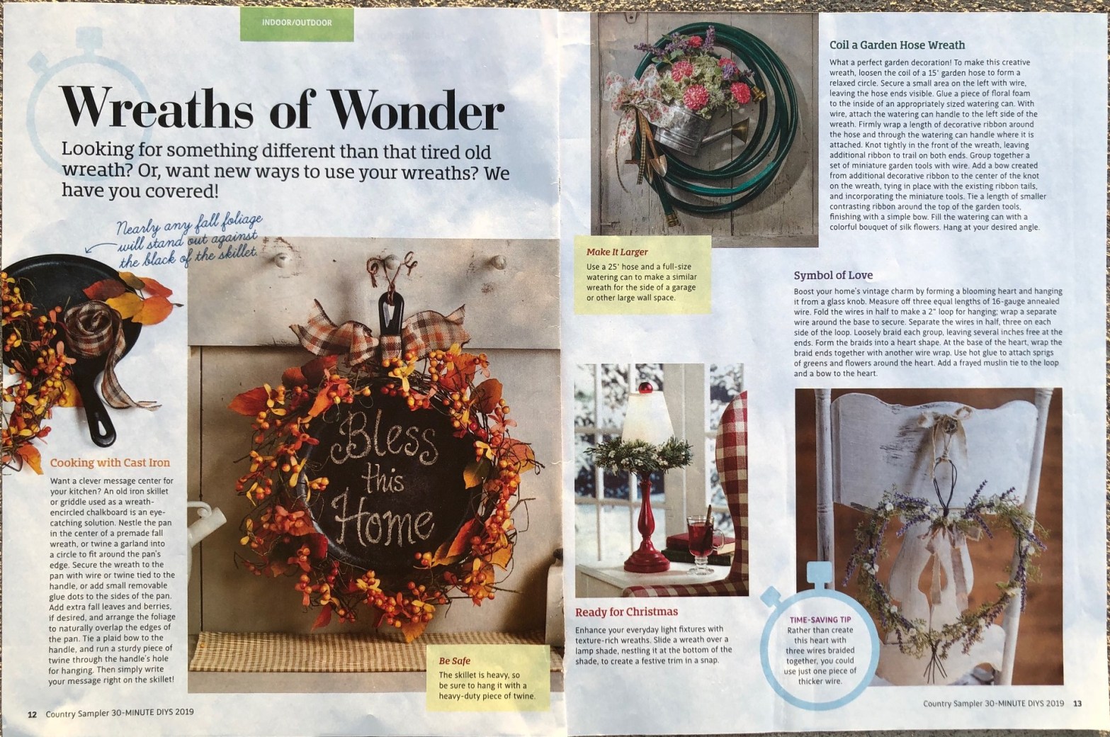
Time and creativity are essential while creating a magazine spread. The appearance is what draws people to read it. The typeface and photography play a big role in this. If the typeface is not pleasing to the eye, it will detract from the article. It will even make it hard or easy to follow. This article is about all the amazing things that can be done with wreaths within different styles. The heading pulls the eye in to understand the article and the pictures make us think, “I want this design.”
Typeface
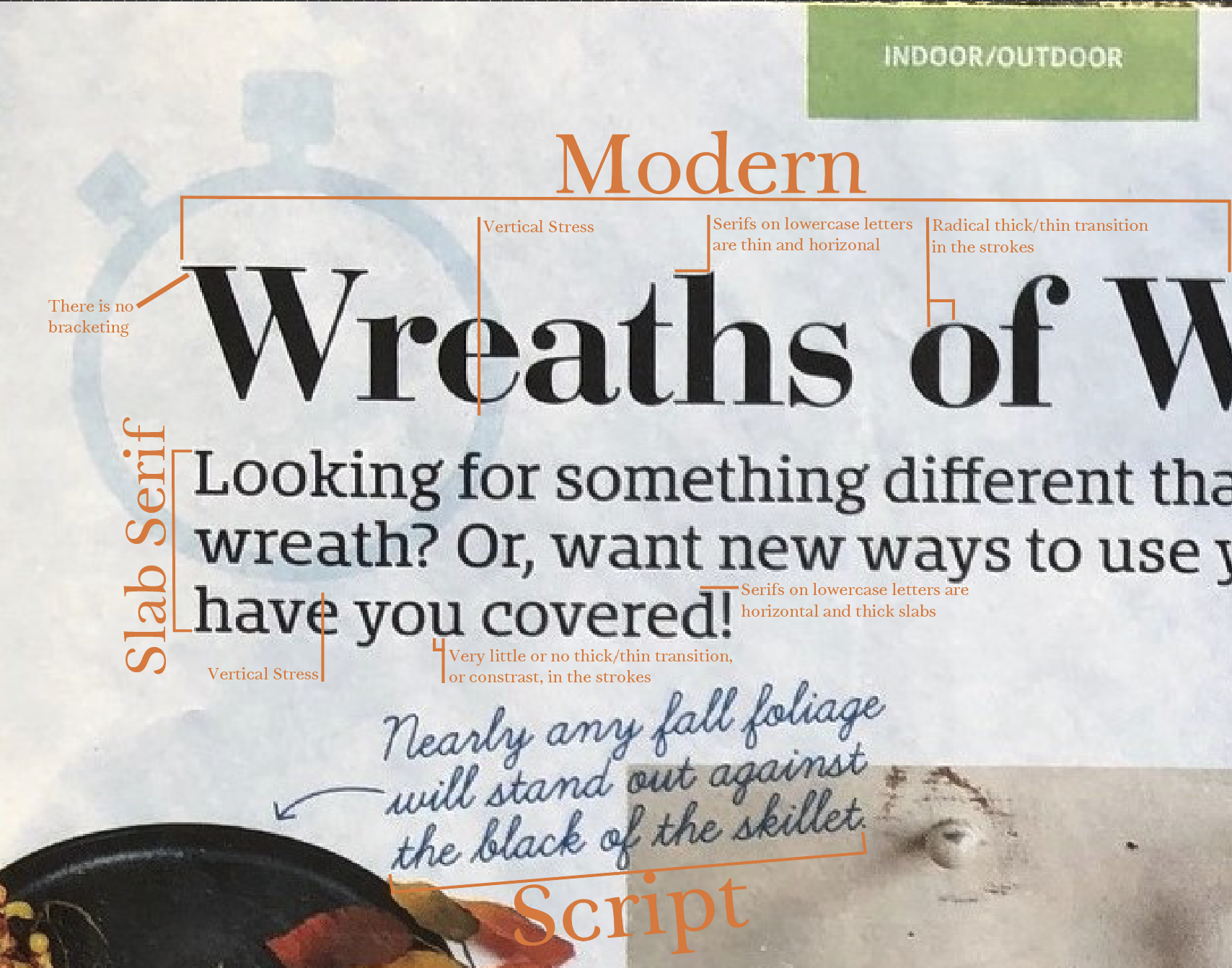
Four different typefaces are introduced in this article. Each typeface shows clear contrast to the other. The heading stands out to draw the eye in.
Details Matter
Modern, Slab serif, Script, and Sans serif: Each picked for clear purpose. The main heading is modern to make a impact on the reader. Modern typefaces provide and elegant look. This is a great choice. It has a clear vertical stress line through each letter. The serif is thin and horizontal, and it has a radical thick/thin transition in each letter.
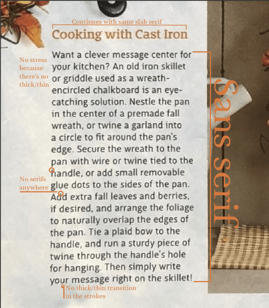
Throughout the article, the headings of each project are slab serif but with a touch of color to match each project mentioned. There is little to no transitions in the lines of each letter. It also has a horizontal serif but is thick and a vertical stress line.
Script is a clever way to draw attention to an added detail with a color contrast. It stands out and points the reader to look. This script looks as if someone has written it and is connected.
The body of the article is written in sans serif. It gives the reader’s eyes a break to get the information without being difficult to read. No stress is visible because no thick/thin lines are in the lettering and there are no serifs.
PHOTOGRAPHY
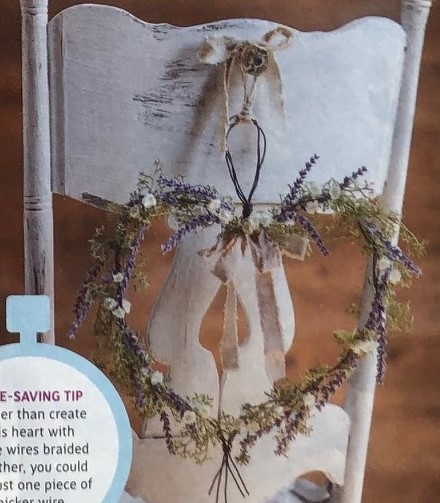
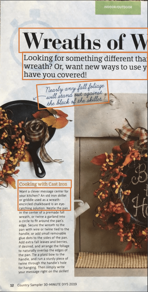
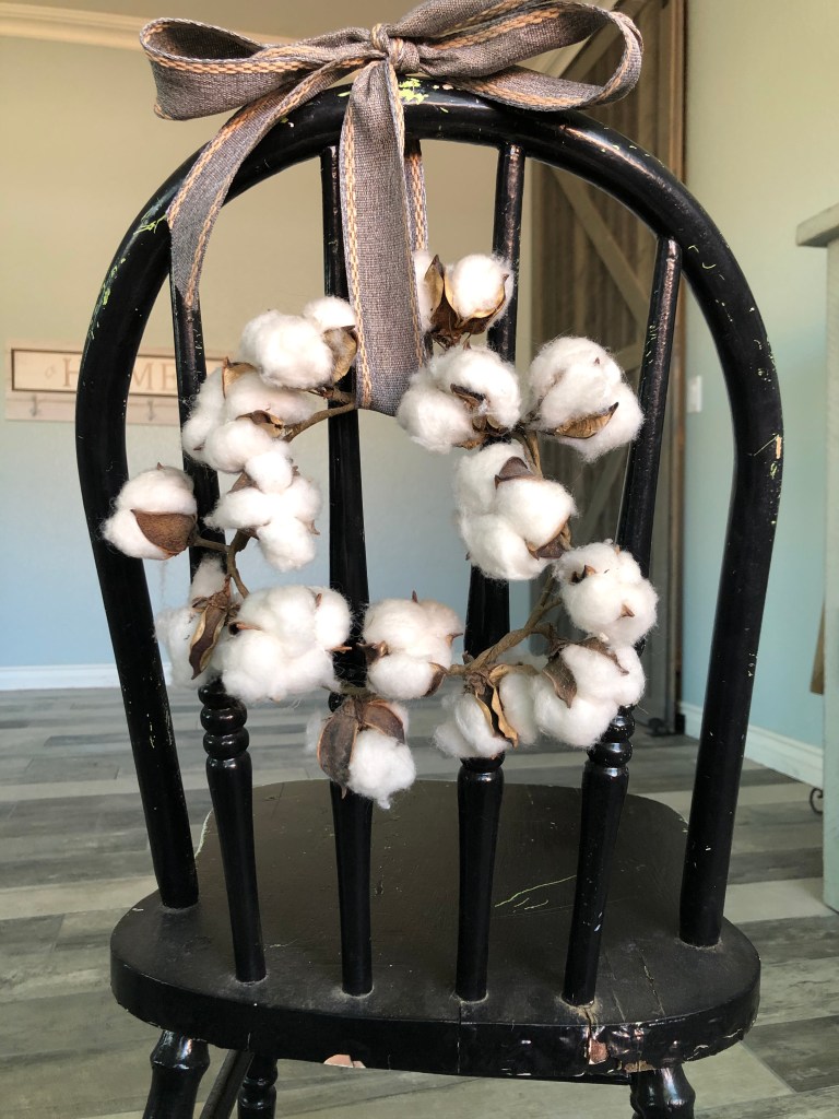
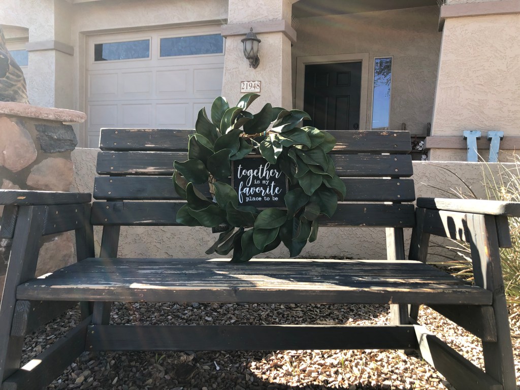
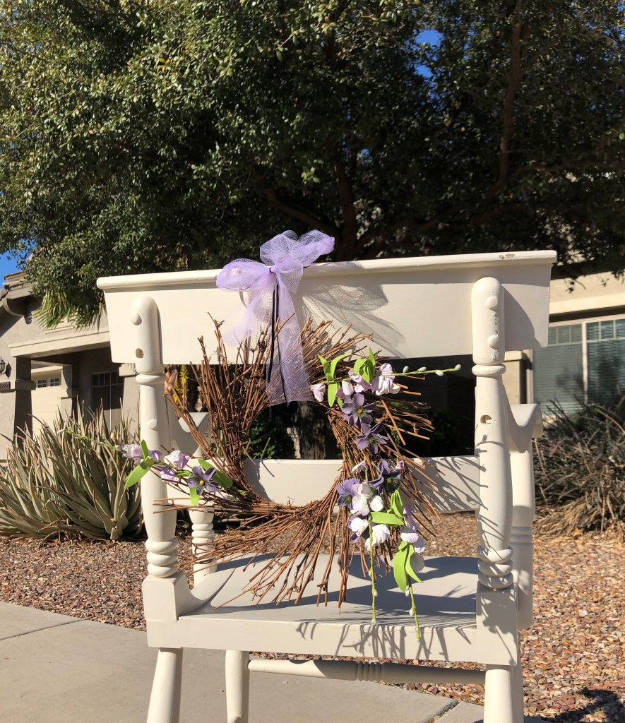
I focused on the concept of wreaths to enhance chairs. In the article, it talks about the symbol of love and how to create the heart. I decided to show different ways a chair or bench can be embellished with a wreath. The photo represents depth of field. The focus is on the chair and heart wreath, while the background is blurred. This brings the eye straight to the purpose of the paragraph without any distractions.
Reverse Engineering Complete
Every little detail is essential in writing a magazine spread. The typeface, information, grammar, and photography all provide consistency and professionalism. Looking for those small details is key to keep a reader coming back. Contrast in the typeface gives purpose to the content and categorizes to provide a roadmap for the reader. The details in the photography establish a focus and creates intrigue for readers to continue. The pictures are what brings the reader in, the typeface is what keeps them reading. It’s all in the details.
