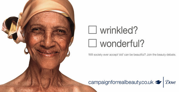
The purpose for this assignment is to analyize the priciples of great design. I chose to focus on alignment, proximiy, color, and contrast. This ad came from http://www.campaignforrealbeauty.co.uk . Let’s dive into reverse engineering.
Alignment
Dove used center alignment between the photo of the woman and the text, but also used left justification at the center mark for the words. With this alignment, it brings the eye back to the woman and what the campaign is about.
Proximity
Proximity is used to focus on the premise of the ad: What is real beauty? It follows up (in smaller print) a call of action to get people thinking and talking about the way society looks at beauty. It is purposeful and to the point.
Color
The use of color (or lack of color) in this ad is amazing. The simple use of the color grey for the text draws us to the words. The color from the image of the woman keeps our eyes wandering back to her. The use of these colors play right into contrast as well.

Contrast
BAMto white to words! The contrast used in this ad campaign is significant. It clearly specifies and brings interest to the ad. The simplicity is purposeful and powerful. It creates intrigue so the audience will want to continue to read by clicking on the link and learning more.
